It wasn’t so long ago that picking a desktop environment for your GNU/Linux system was a Coke/Pepsi/RC experience. In recent years, though, we’ve seen an explosion of projects promoting new and interesting options for your graphical environment. Having failed to find a good showcase for the various options, I thought I’d put together a blog post giving a quick summary and some visuals for each option.
The stalwarts
KDE Plasma
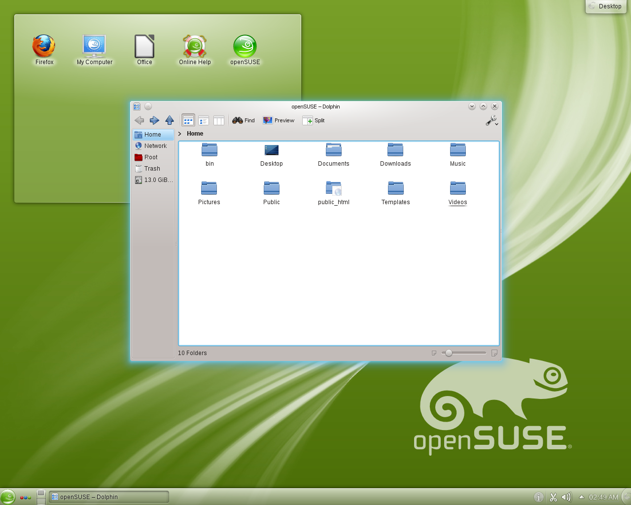
Figure 1: KDE Plasma 4 running on OpenSuse
KDE was arguably the first “desktop environment” available for Linux. Currently poised to release version 5 of its Plasma desktop, KDE boasts a thoroughly modern desktop experience bundled with a wide catalog of desktop applications. KDE focuses on being highly configurable and malleable, with a huge list of configuration options, downloadable themes and widgets, and a desktop shell that can be transformed in a number of drastic ways.
Critics usually claim that KDE is too complicated, slightly unstable, bloated, and something of a resource hog.
Overall, I recommend KDE if you have newer hardware, like eye-candy and desktop-tweaking, but don’t want to dig around in cryptic config files to do it.
GNOME Shell
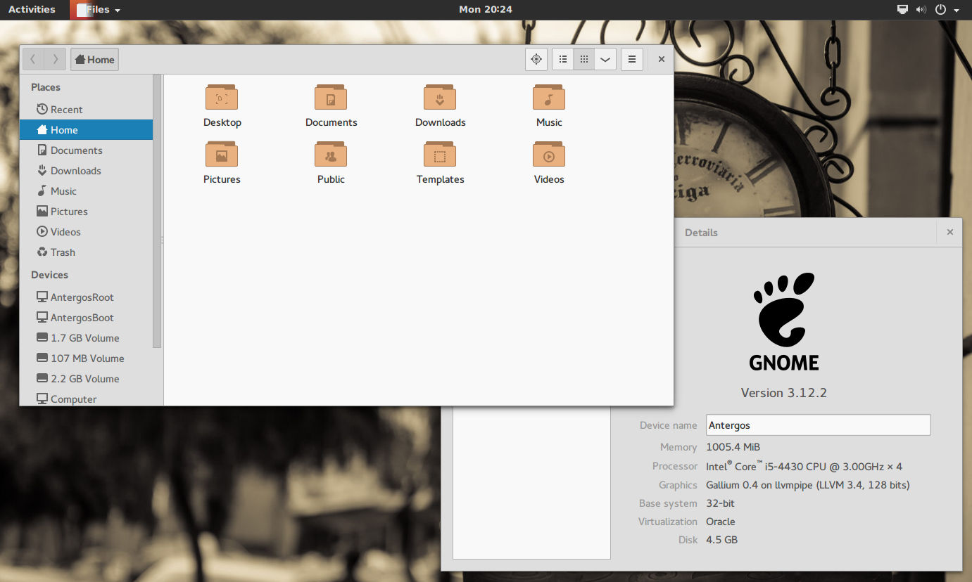
Figure 2: GNOME 3 running on Antergos
GNOME has long been the default desktop environment for many high profile distributions such as Red Hat (and its family, CentOS, Fedora, etc), and Debian. The project dates back to the 90’s and also boasts a solid catalog of associated applications.
In its favor, GNOME is simple, aesthetically pleasing, and ergonomic. Critics would say that it’s restricting, that it imposes a certain workflow, and that it’s slightly heavy on older hardware. They also tend to say it’s too touch-oriented and tablet-like.
I recommend GNOME if you have newer hardware and want a beautiful, functional experience out-of-the-box with little tweaking.
Try GNOME Shell on: Fedora Linux, Antergos, or Debian
XFCE
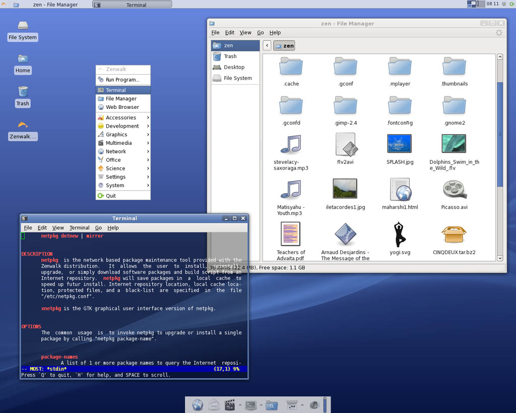
Figure 3: XFCE on Zenwalk Linux
XFCE has always been that “third candidate” sitting quietly in the background while KDE and GNOME battled it out. Based on much of the same technology as GNOME, it always worked well with GNOME software, but was designed to run on fewer resources. XFCE is solid and reliable, and sticks to tried-and-true technologies longer.
On the good, XFCE is lightweight but still feature-packed and configurable. Critics would say that it’s development cycle is glacially slow and that it looks dated.
I recommend XFCE if you want a lightweight desktop that’s easy to configure to your needs and won’t change much over the years.
Light ‘n’ snappy
LXDE
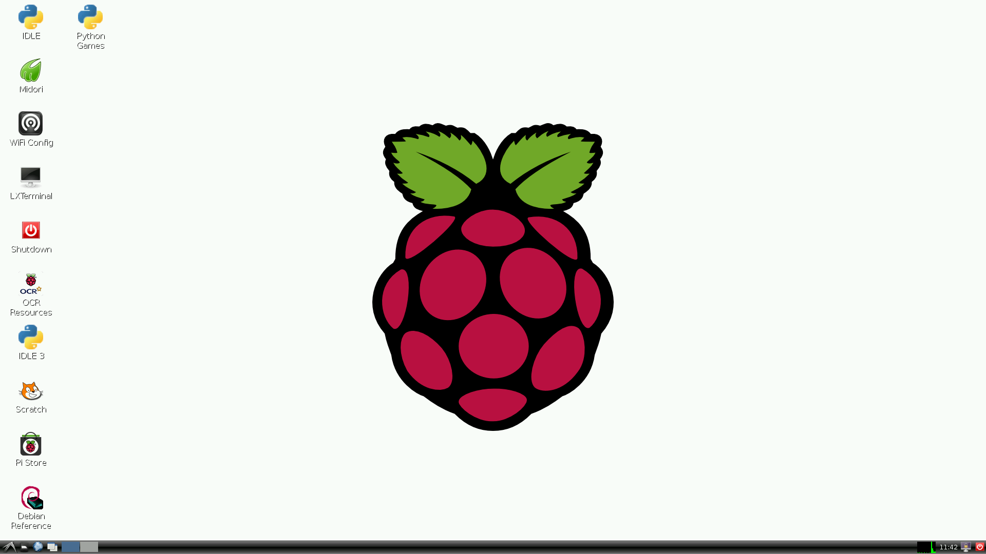
Figure 4: LXDE in Raspbian
The LXDE project came along a few years back with the aim to develop an even lighter desktop than XFCE. The result is a desktop environment that is fast and functional even on very old and slow computers, with a familiar layout reminiscent of Windows XP.
Its primary advantage is being small and light, but its familiar Windows-classic layout is also nice for people who felt comfortable with older versions of the Legacy OS.
Critics might say that it lacks some features, and needs to borrow applications from other environments.
Overall, I’d recommend it if you need a familiar desktop feel on an older system.
Enlightenment
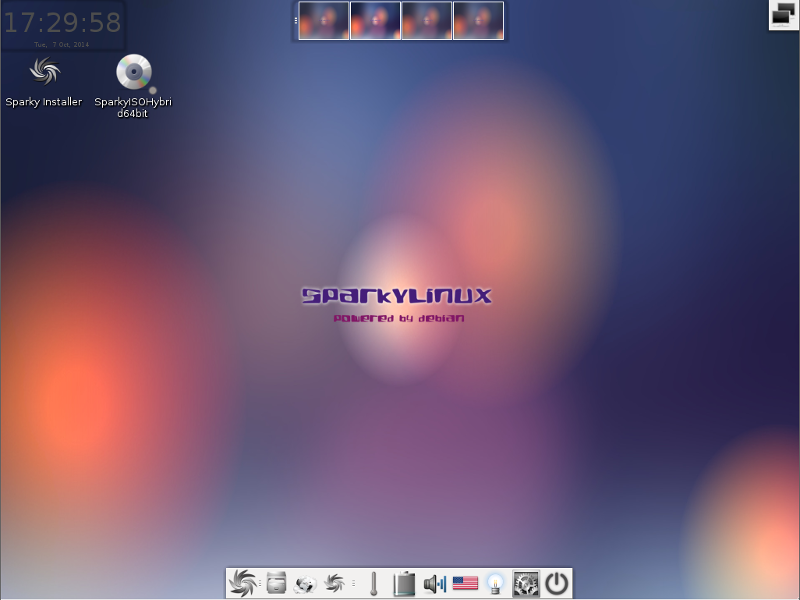
Figure 5: Enlightenment (v19) running on SparkyLinux
The Enlightment project has been around since the 1990s as a window manager, but its version 17 release a few years ago brought so many features that it really qualifies more as a desktop environment now. Now on version 19, it provides a reasonably lightweight desktop environment with lots of configurability and plenty of eye-candy.
Enlightenment can be easily configured to emulate a number of common desktop configurations, and has a number of distinctive themes available.
Critics would say that Enlightment’s themes and effects tend towards tackiness, and that parts of it feel less-than-finished.
I’d say Enlightenment is a nice choice if you want something light that offers plenty of configuration options and a very different look and feel from traditional environments.
Try Enlightenment on: Bodhi Linux or Sparky Linux
LXQT
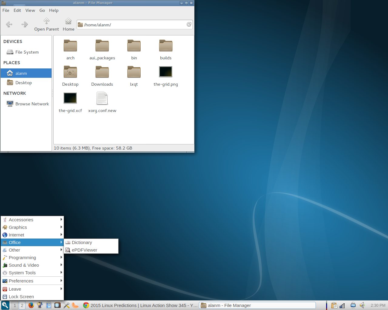
Figure 6: LXQT running on Arch Linux
Born from a fusion of the LXDE project and the Razor-QT project, the LXQT desktop is the heir-apparent to LXDE. Currently at version 0.8, it’s not considered to be “done”, and many distros don’t package it quite yet. Even so, LXQT already presents a simple and familiar desktop experience with low resource usage.
Built on many of the same libraries as KDE, we expect to see LXQT borrowing a lot from the Plasma desktop as it moves forward, while retaining the spirit of light resource usage and the simple layout.
Critics would point out that it’s a bit heavier than LXDE, and of course it’s not ready for prime-time yet.
Once it’s ready, I’d recommend LXQT for anyone wanting that “Windows classic” style desktop on old or low-end hardware.
Try LXQT on: Arch Linux
Distro-specific
Desktop environments used to be primarily projects unto themselves, like KDE and GNOME, which shipped in many distros. Starting with Ubuntu back in 2011, though, many distros started their own desktop environment projects to provide their distro with a distictive look and feel. While some of the DE have become available on multiple distros, they’re still primarily developed by (and best used on) their parent distribution.
Unity
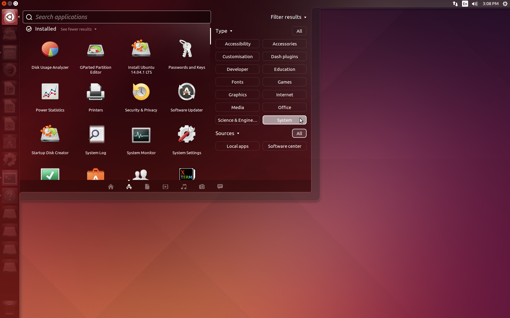
Figure 7: Unity on Ubuntu 14.04
Ubuntu’s Unity desktop is probably familiar to anyone who has gotten into Linux over the last couple years; it’s typically the first stop for new Linux users. Unity takes inspiration from OSX, with its dock and global menus, while maintaining a few unique features of its own. It builds on GNOME technologies and borrows the majority of default applications from the GNOME ecosystem.
The move to Unity was controversial, and stirred up strong feelings both for and against. Proponents say that it is aesthetic, ergonomic, and very easy to use. It can be very keyboard-driven and has some unique bits like the HUD (a search-driven interface to application menus) and the Dash (a search-driven, Internet-aware, pluggable application menu).
Critics would say that Unity lacks configurability, is somewhat heavy on older systems, and ships with some unappealing commercial elements (such as Amazon search integration in the Dash). Some feel that, like GNOME, it’s too much like a tablet interface.
Unity is a good choice for casual computer users who want an easy, modern desktop with some OSX influences, and for users who want a keyboard-driven experience with some eye candy.
Try unity on: Ubuntu
Cinnamon
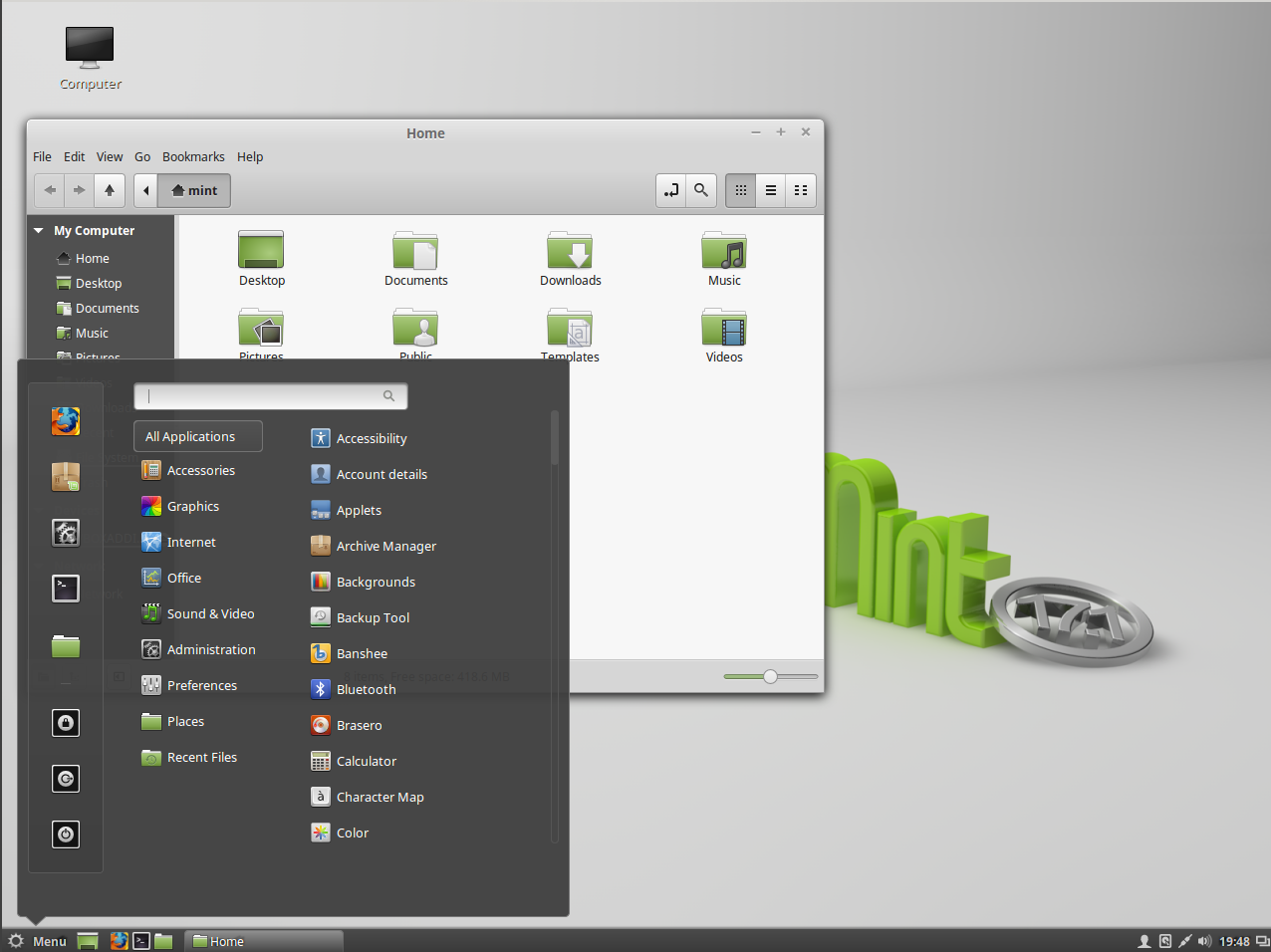
Figure 8: Cinnamon desktop running on Linux Mint
Unhappy with the direction of GNOME 3, the Linux Mint project decided to create its own fork of GNOME 3 called “Cinnamon“. Originally it was aimed at recreating the GNOME 2 experience on top of GNOME 3 technology, but recent versions seem more like a traditional Windows-style desktop.
Like Unity, (and perhaps moreso) Cinnamon is essentially an alternative front-end for GNOME; many of its applications are GNOME applications, or forks of GNOME applications. Its configurability lies somewhere between GNOME and KDE, though serious desktop ricers are probably not going to be impressed.
I’d say Cinnamon is a good choice if you like GNOME but want a more Windowsy layout and a little more tweakability.
Try Cinnamon on: Linux Mint
Pantheon
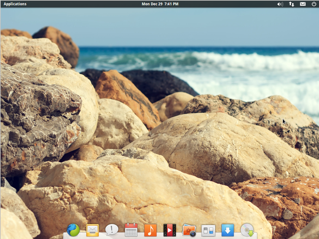
Figure 9: Elementary OS’s Pantheon Desktop environment
The developers of Elementary OS set out to create a desktop experience defined by elegance, beauty, and user-friendliness. What they ended up with is Pantheon, a built-from-scratch desktop environment that bears a striking resemblance to OSX. Like the fruity OS, Pantheon sports a menu bar along the top and an application dock along the bottom; the applications tend to be minimalistic and simple to use; and the themes are stark and zen-like.
Critics of Pantheon dislike its extremely limited configurability and lack of advanced features. It’s also limited to ElementaryOS, which itself has a long and slow development cycle (the current stable release is based on Ubuntu 12.04).
Overall, if you want a minimalist OSX-like experience on Linux, Pantheon is your desktop.
Try Pantheon on Elementary OS
Deepin DE
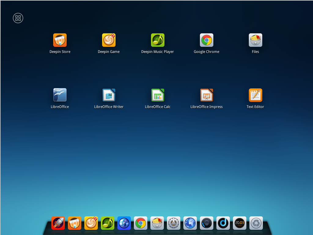
Figure 10: Deepin Desktop, running, of course, on Deepin Linux.
Deepin is a distro that hails from China, and its Deepin Desktop Environment is unique to this Ubuntu derivative. The desktop is bare apart from an OSX-style dock at the bottom. Applications are launched from a full-screen launcher (also like OSX). Configuration is done through a pop-out side panel that looks very Android-ish.
Deepin desktop doesn’t seem to be based on anything else, but its meat-and-potatos components (file manager, text editor, etc) are GNOME applications. It’s a bit on the heavy side, and doesn’t offer a lot of configurability, but might be a nice option for those who want a sparse but consumer-friendly desktop.
Try Deepin DE on: Deepin
Budgie
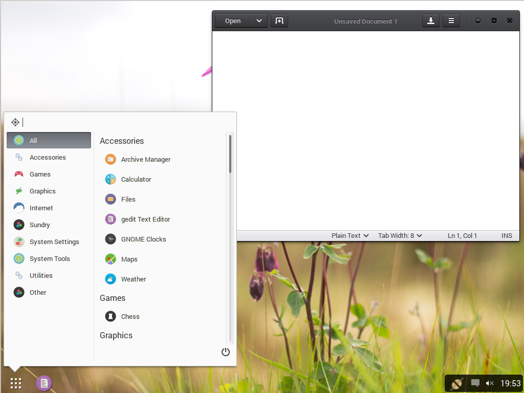
Figure 11: Budgie running on Evolve OS
Still in early development, Budgie is another GNOME fork set to be the default desktop for Evolve-OS. Budgie’s minimal desktop bears a strong resemblance to ChromeOS. In many ways it’s similar to Cinnamon, but aims at providing a smaller footprint and a drastically simpler experience.
Budgie is still in development, but current releases show a very basic, spartan desktop with a single panel and a traditional application menu.
Try Budgie on: Evlolve OS
Keeping the flame alive
Not everyone is happy with the new developments in desktop environments, and truth be told there is nothing like having a well-worn tool to work with when you just need to get things done. A few desktop projects are keeping some of these older code bases fresh and active.
Mate
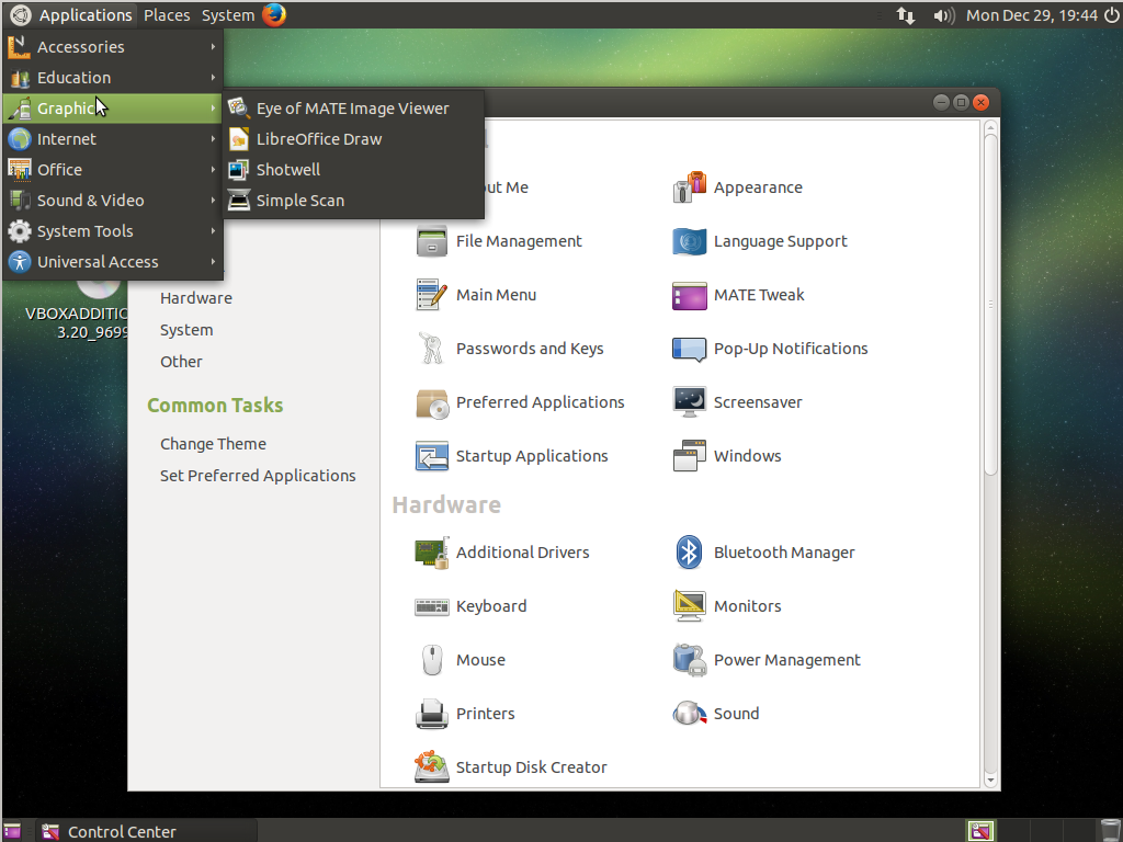
Figure 12: MATE desktop on Ubuntu Mate Edition
GNOME 2 was the desktop that ruled the aughties: for most of the decade, high-profile distros like Ubuntu, Red Hat, Mint, and Debian chose it as their flagship desktop. It garnered loyal fans and defined the Linux desktop experience for millions of users. Between GNOME 3’s radical (and often controversial) changes and Ubuntu’s move from GNOME 2 to Unity, a fierce and doggedly loyal community of GNOME 2 users emerged. The Mate (pronounced “Mah-Tay”) project carries on development of the GNOME 2 code base, keeping it fresh and adding new features as well.
Mate’s older codebase works a little better on older machines; it’s not as light as XFCE or LXDE, but having been the former desktop champ it boasts plenty of features and stability. It’s a good choice for those who want a no-compromises desktop without the eye-candy and resource usage of modern environments.
Try MATE on: Ubuntu MATE edition, Linux Mint MATE edition
Trinity
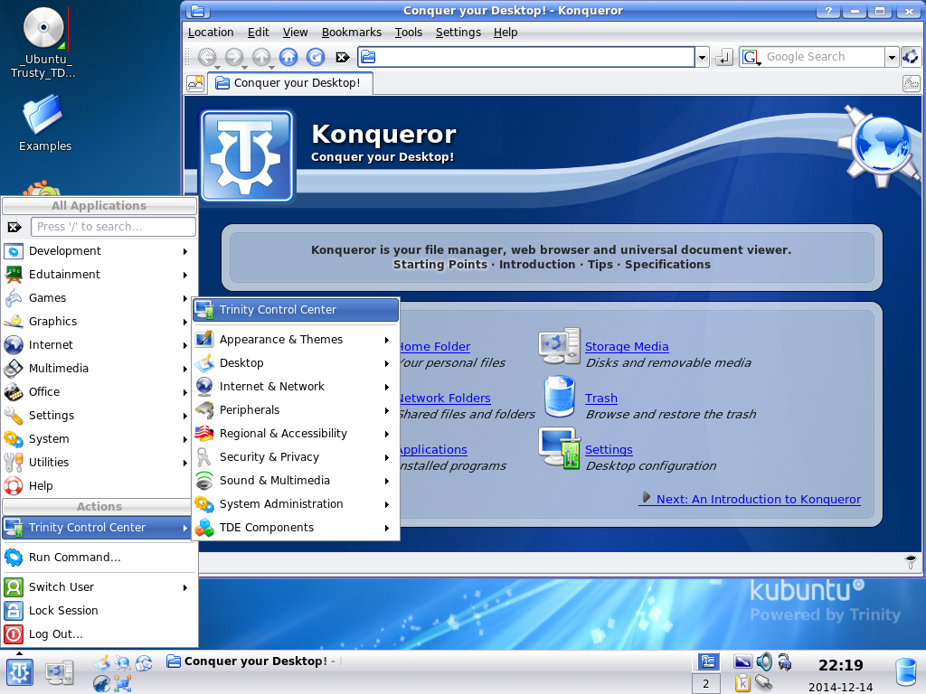
Figure 13: Trinity desktop running on Kubuntu
The initial releases of KDE 4 were something of a debacle, lacking it key features and riddled with bugs. It prompted a few high-profile defections to GNOME and, eventually, a fork of KDE 3 known as Trinity. Trinity hasn’t gathered the same momentum as Mate (perhaps positively attributable to Plasma’s subsequent development), but nevertheless keeps the KDE 3 experience alive for future generations.
Like modern KDE, KDE 3 / Trinity is highly configurable and has a wide selection of integrated applications. Being an older code base, it runs well on older systems. If you want a tweakable desktop packed with features that runs on your Pentium 4, Trinity is probably a top choice.
Try Trinity desktop on: Q4OS
CDE
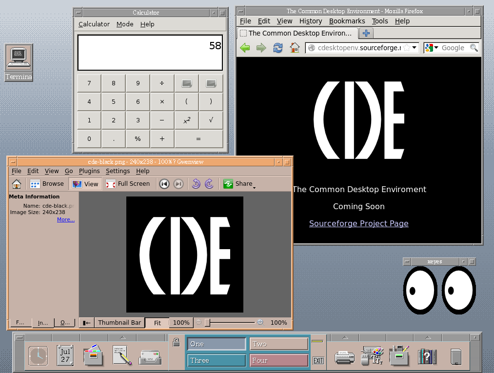
Figure 14: The Common Desktop Environment, running on a steam-powered difference engine.
If you sat down to a commercial Unix workstation some time in the 1990s, you were either looking at a terminal or you were looking at CDE. CDE, the “Common Desktop Environment”, was created as a collaboration between a number of the top Unix vendors to be the Unix X11 desktop. It inspired a lot of early Linux desktop environments, including KDE and XFCE. In 2012, CDE returned from the past as open source code, and work began to port it to modern Linux.
CDE is definitely a 1990s desktop, full of chunky graphics and flat colors. Many may see it as just a nostalgia or historic piece, but it is, after all, the work of some of the greatest tech companies of the age, and well worth a look.
Try CDE on: CDEbian Live CD
WindowMaker/GNUstep
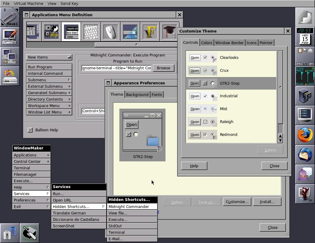
Figure 15: WindowMaker running on Debian, from the WindowMakerLive CD
While we’re in the world of 1990s commercial Unixes, WindowMaker, along with the GNUstep framework and applications, aims to recreate the NeXTStep experience on Linux. In case you don’t know your Unix history, NeXT was a Unix company founded by Steve Jobs after he was ejected from Apple; Apple later bought NeXT when Jobs returned, and the NeXTStep operating system evolved into the OSX we know today.
WindowMaker/GNUstep certainly makes for a desktop experience unlike many others; it certainly looks very 1990s (though perhaps a more elegant 90s than CDE portrays), and takes a little getting used to for modern users. Many still find it a productive environment, though.
Try WindowMaker/GNUstep on: Window Maker Live
The Way(land) ahead
X11 has been on the way out for a few years now, and most of the major desktops are working towards compatilbity with its successor, Wayland. Rather than merely porting X11 desktops, though, a few projects are working to create a completely new desktop experience built specifically for Wayland.
Hawaii
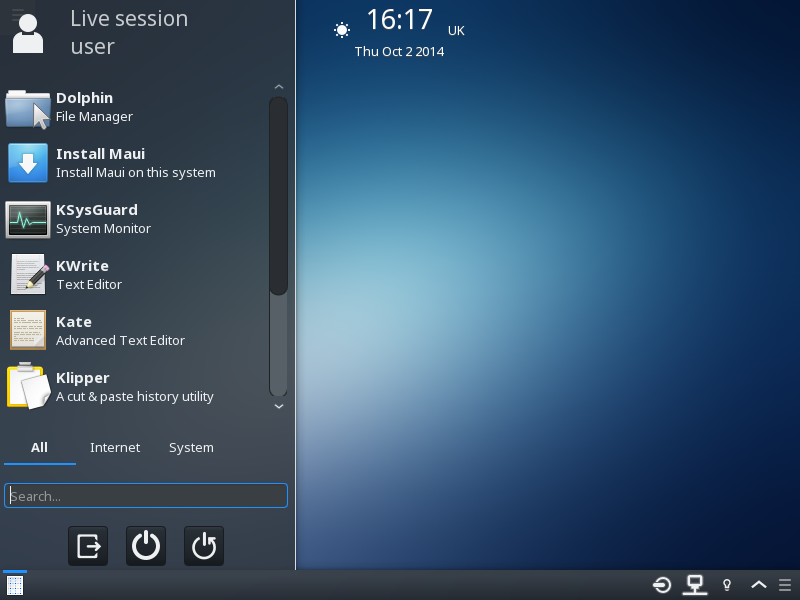
Figure 16: Hawaii running on Maui 0.5.1
The Maui project is a Linux distribution that’s aiming to build a next-generation Linux desktop. It’s desktop environment, Hawaii, is built on the much of the same technology as KDE, but for Wayland rather than X11. Although still in heavy development, early impressions are that Hawaii will be a simple but modern experience, built for the desktop but with some definite influences from mobile computing.
Try Hawaii on: Maui Project
Maynard
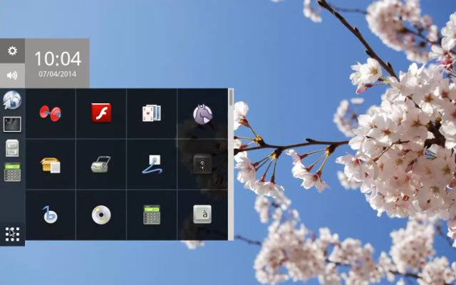
Figure 17: Maynard desktop environment for the Raspberry Pi
Maynard is a wayland desktop designed for speed and a light footprint. Currently its being developed specifically for the Raspberry Pi, though it may branch out onto more traditional platforms in the future. Maynard is based on the same toolkit as GNOME, and bears some similarities to GNOME shell.
If you have a Raspberry Pi, you can install Maynard from these instructions.
The rest of the iceberg
This is by no means the end of the options for Linux graphical interfaces; for the truly intrepid or hard-to-satisfy, there are other more obscure, defunct, or alpha-quality desktop environments, and of course the whole universe of window managers1. With so much to choose from, there should be an option to please almost anyone; and if not, there’s always next year…
Footnotes:
A “window manager” is a program that allows you to move, resize, and otherwise “manage” windows on your desktop. All desktop environments include a window manager, but some window managers have enough extra features (panels, menus, launchers, etc) to stand on their own as a graphical interface. Yours truly is a fan of the Awesome Window Manager, which I use on all my “daily driver” computers.

Yup, Awesome WM is Awesome. Recently I have checked new Gnome after many years and I felt worse then when I opened Vi for the first time in my life. Totally lost! And Gnome 3 should be “nice and easy”.
Enlightenment 19.5,Lxqt and Mate are or will soon be ready for wayland. Wayland and a lightweight DE is what I want. I like light weight distros and programs no matter what computer I use.
Great roundup. Thanks.
Very well done. Thanks for making the effort….ron
Fantastic round up. Really helpful
This only covered “classic window managers”, eh?
Anyway, i like the look of those “wayland-targeted-wms”.
I dont mind having a slightly mobile oriented user-interface, as long as its not “mobile-only”.
I think the mobile style should just be one of at least 2 ways to easily navigate.
At least keyboard shortcuts to open applications, close them and get a terminal on the screen should exist.
From there it doesnt matter much, how the rest of the ui looks.